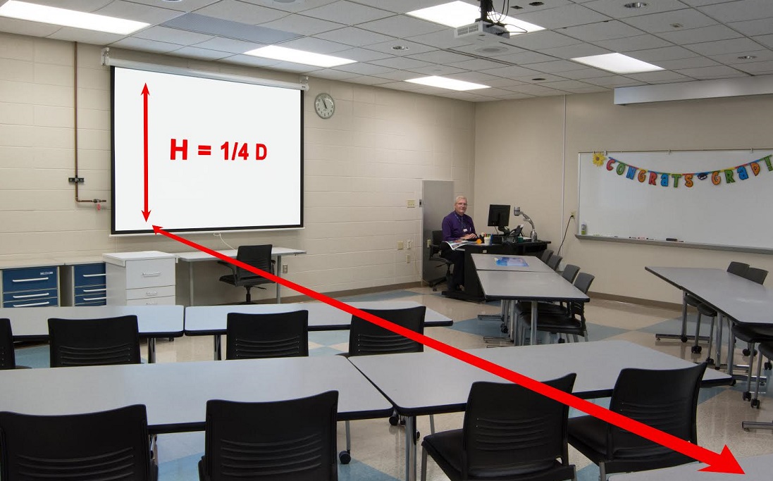
There’s no escaping the 1/4 Rule. IT managers may not know about it, but many AV and media people do. It states that the minimum height of classroom displays, or any display used to show small text, must be at least 1/4 the distance to the farthest viewer (see section below).
If it’s not, text on the screen won’t be readable to those in the back. It’s an update of the older 1/6 rule, used to size screens for the large text in PowerPoint presentations. [related]
If you think about it, the 1/4 Rule pretty much rules out the use of a flat-panel classroom displays as the main viewing screen in a classroom, whether in a K-12 school or university.
Why? If the typical American classroom is at least 20’ deep (or 240”), then the minimum screen height must be 60” or the height of a 113” diagonal display. While it’s true that you can buy a flat panel that large, it’s far too expensive for most classrooms.

Sometimes you see this screen-sizing rule expressed as the Four-Six-Eight Rule. The farthest seat can be no farther than 8X the screen height if you’re showing only video, 6X if you’re showing large text from PowerPoint, or 4X if you’re showing small text from a spreadsheet, document camera or web page.
In this light, a 100 – 120” classroom solid state projection screen makes a lot of sense. Yet many IT managers don’t like projectors, because traditionally they require a lot of maintenance and break down more often than flat panels.
They know, too, that LED-lit flat panels are ‘greener’ than projectors using mercury-vapor lamps that must be disposed of properly and can release hazardous materials into a classroom.
Is there a way to combine large screen sizes with high reliability, concern for the environment and high image quality at an affordable price? As the strategic planning manager of Casio America, I happen to know there is.
Solid State Projection
Since 2010, Casio has offered a line of classroom projectors that use a hybrid LED and laser light source instead of a projection lamp. More recently, several manufacturers, including Casio, have begun offering projectors using an all-laser light source.
Either way, these new technologies promise a 20,000 hour expected lifetime without ever needing to change a lamp. Better still, they run cool, avoiding the high heat that lamps generate and that’s so destructive to electronics and power supplies.
Running cool is a major benefit for any electronic product. For our LED/laser projectors, we believe it is one of the reasons that we have seen a remarkably low rate of repair.
Cool operating temperatures also help make a 20,000 hour lifespan possible. Another reason is the dust resistant design of solid state projection solutions blocks off the optical engine.
There are fans to cool the power supply and light source, but any dust coming through does not get into the optical system, maintaining brightness for the majority of the life of the projector. And 20,000 hours is a long time in any classroom, more than 18 years if the solid state projection is used six hours a day, 180 days each year.
Measure Your Classrooms
Does the 1/4 Rule apply to you? It’s easy to find out.
First, just walk through your school and talk to your teachers. What are they projecting? Big text from PowerPoint or smaller text from websites, diagrams, drawings, or documents? Then choose a rule of thumb: 1/6 for larger text,1/4 for smaller.
Next, measure your classrooms. How far is it from the screen to the farthest seat from the solid state projection surface, in inches?
Finally, apply the math. You may find this ratio helpful: the diagonal of 16:10 classroom displays (1280×800 or 1920×1200) is about 1.9 times its height. (So if you find you need an image 60” tall, the diagonal is 60 x 1.9 = 114”.)
Now you have what you need to make a good decision. You know the minimum screen size that will be readable, and you understand the key differences between traditional, bulb-based projectors and LampFree.
1/4 Rule Explained
The 1/4 Rule is less a rule than a rule of thumb, based on experience and more complicated calculations.
The real question is how big a character of text must be in order for the eye to resolve it at a given distance.
Experts define that in terms of the percent of the field of view that the human eye can perceive: 7 – 10 arc minutes, with an arc minute defined as 1/60 of one degree in the 360 degree field that constitutes human vision.
One way to use this fact is to take the viewing distance you have and figure out the minimum character height people can read. It turns out that the distance divided by 500 equals the height of a figure or an object that takes up 7 arc minutes, the bare minimum that a person with 20/20 vision can discern.
For example, in our 20’ classroom, we can calculate that the minimum height of a lower case character at 7 arc minutes will be .48 inches. That is, 20’ = 240 inches/500 = .48” (or 12.2 mm).
That height in turn relates to font size, but realizing that character size varies with the particular font and with the resolution of the computer and solid state projection that produces it. For XGA or WXGA classroom displays (800 pixels high), that 12.2mm character is roughly the size of 10 pt Arial. The 1/6 Rule is derived from this calculation.
That sounds encouraging, in that our 20’ classroom would thus require only 78” diagonal classroom displays.
Seven arc minutes, however, is really small. Using it assumes that everyone seated in the back row has perfect vision. At 10 arc minutes, we need 14 point type, at 1280 x 800 resolution. If we go to 1920 x 1200 classroom displays, the font size must increase even more.
You can see the readability issue for yourself with your computer monitor, a tape measure and any text editing software. First open a blank document, type a couple of lines of text, then copy and paste it twice. Now size the text in 8 point, 10 point and 14 point Arial or Helvetica.
Read Next: How Virtual Reality Provides Limitless Education Market Opportunities
Next measure the height of your monitor, step back and look at it from 4x and 6x its screen height. How hard is each size to read? How comfortable would you be reading text that size all day, every day from the back of a classroom?
Thus we can see that the 1/6 Rule works, in practice, only if we’re using PowerPoint slides with relatively large text. For smaller text on web pages and other materials, the 1/4 Rule is a better choice.


")